When summer temps hit the valley of the sun there are only a few acceptable activities. One, of course, is hanging out in the pool; another is anything that can be done inside with air conditioning and a cold drink in hand. (The latter situation is also familiar to my northern friends who hunker down to escape the blustery cold of winter.)
As a teacher, I spend a good deal of my time in the summer thinking about and planning for school (which gears up at the beginning of August), but since I don’t have to do those activities on a bell schedule, I also get to spend a good deal of time in my studio. On 115 degree afternoons, the coolness of the basement beckons me to color, cut, and paste.
Thus, our Colarting (where coloring meets art) kits provide a means to escape the heat and create something to hang in my room, office, or home. Let me show you how it works with the Dreamy Kitty design.


Each kit comes with three or four layers (depending on the picture) to create a 3-D design along with a package of standard embellishments and the foam tape used to give the art dimension. Full instructions are also included, along with a bonus coloring page.
In step one, each of the layers is colored in preparation for cutting and stacking. While a person could leave the larger shapes blank (white), I suggest filling them in to provide a background when looking at the pieces at an angle. This helps the piece look more professional when its complete.

The middle layer has a gray space around the pieces to indicate what will be cut away. Because I know I’m going to cut these out, I don’t worry about staying inside the edges. As a matter of fact, I intentionally go over the line to make sure I fill in all of the white space. In addition, when I’m using several shades of the same color (like two shades of green on the squirrel shape), I color the entire shape in the lighter color using a chisel tip marker, and then go back with the darker color and fill in the details using a fine tip marker. This makes it much easier to color small, detailed areas.
As you can see, I have written the color numbers I used across the top (which will get cut off). Since I don’t always have time to color all of the pieces at once, this helps me remember which markers I used so I can carry the color theme over to other pieces.
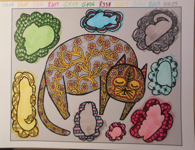
The top layer consists of cut outs that will rest on top of the middle layer pieces. I used the same basic colors to complete these pieces, too.

If you plan to use a photo mat (which I highly recommend since it adds a professional finish to your artwork), put the background in the mat before you begin adding the layers. This allows the layers to stick out over the edge of the mat and adds to the 3-D effect.

Now you’re ready to cut out the middle and top layer pieces.
Once everything is cut out, open up the embellishment packet and locate the foam tape squares. These will be applied to the back of the cut out pieces in order to create a 3-dimensional effect on your artwork.
It’s always a good idea to space out the foam tape squares around the edges of larger pieces (like the kitty). The smaller pieces may only need one or two squares to support them. Remember to plan the number of squares per piece to make sure you have enough.
Once the tape is stuck to the back of the layers, peel off the wax paper backing and apply the middle layer to the background.

Repeat the application process with the smallest top-layer pieces. Here, the angled photo gives a better look at the shaded in bottom layers. (Take a look in the lower left corner under the lizard.)

Once all the layers of the picture are attached, it’s time to have some fun with the embellishments. The packet contains basic embellishments in clear and silver to match any color scheme. Of course, you can always add extras from your own stash. (Consider buttons, beads, jewels, trims, pieces of broken jewelry, or even origami.)
If you don’t have a stash, we offer additional embellishment kits in multiple colors. (All of our kitty-themed demos on the website feature standard embellishments. The other themes sport a variety of items from my studio.)
Arrange the embellishments wherever you like. (I suggest placing all of them on the piece before gluing, just to make sure you like the layout.) Regular white glue or craft glue will work to attach the embellishments, or if you’re impatient (like I am), use a hot glue gun for immediate gratification.

Finally, don’t forget to sign your work before putting it into a frame. Our kits create an 8 x 10 picture which fits into an 11 x 14 mat and frame. (I suggest you get a shadow box frame so your work will be protected behind glass.) If you use a non-shadow box, simply remove the glass to allow space for your 3-D design to pop out of the frame.

The final product is a one-of-a-kind piece of art ready to adorn your office or home. Our whimsical designs are perfect for kids rooms, dorm rooms, hallways, and cubicles. They make great gifts as a project to be completed or as a finished product to make someone smile.
Check out the nearly 30 designs available at thecockeyedcolorist.com. Happy colarting!


.jpg)
.jpg)


 Then, there’s the knight-in-shining-armor themed table lamp. I fear my feline friends might try to stage a joust with these accoutrements. Or, worse yet, it might provide weapons for would-be intruders.


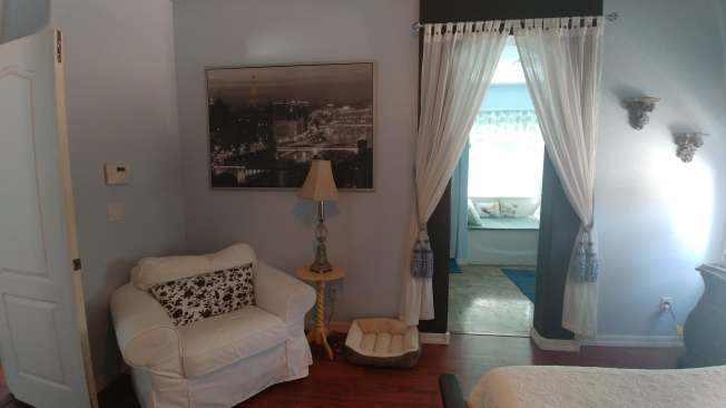
 In the end, Lochinvar also suggested that I could work some fru-fru magic on our bedroom. (Of course, he didn’t have to say that twice!) So, that project is currently underway. I have already added curtain panels from Goodwill (a bit of sheer lace over a print at the window and some dotted swiss in the archway), reupholstered the seat over the tub, hung some peacock art, and added a comfy chair to the space. Meanwhile, those map covered drawers continue to dance through my head as I survey two night stands, a headboard, and a foot board. I think they’re calling my name!


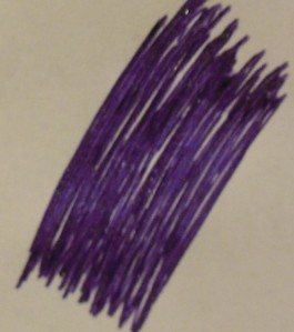 This is how my gel pens look on a larger swathe of page. As you can see, there is quite a bit of open space, even though I colored the area twice.
 Next, I turned the page 90 degrees and colored the other way. While this helped fill some of the gaps, there is still plenty of paper showing through.
 Of course, I could use a fat-tipped marker to get better coverage. (This patch was done with a Sharpie.) But it lacks the lovely sparkle and the intensity of color from the glitter pen.
 So, I married the two to get the best outcome. Here is the Sharpie base with the glitter gel on top. This has the full coverage of the marker with the sparkle and saturation of the gel pen.


